Background
Project background
Escrow.com is a trusted online platform that provides secure and efficient escrow services for a wide range of transactions, offering peace of mind to buyers and sellers worldwide.
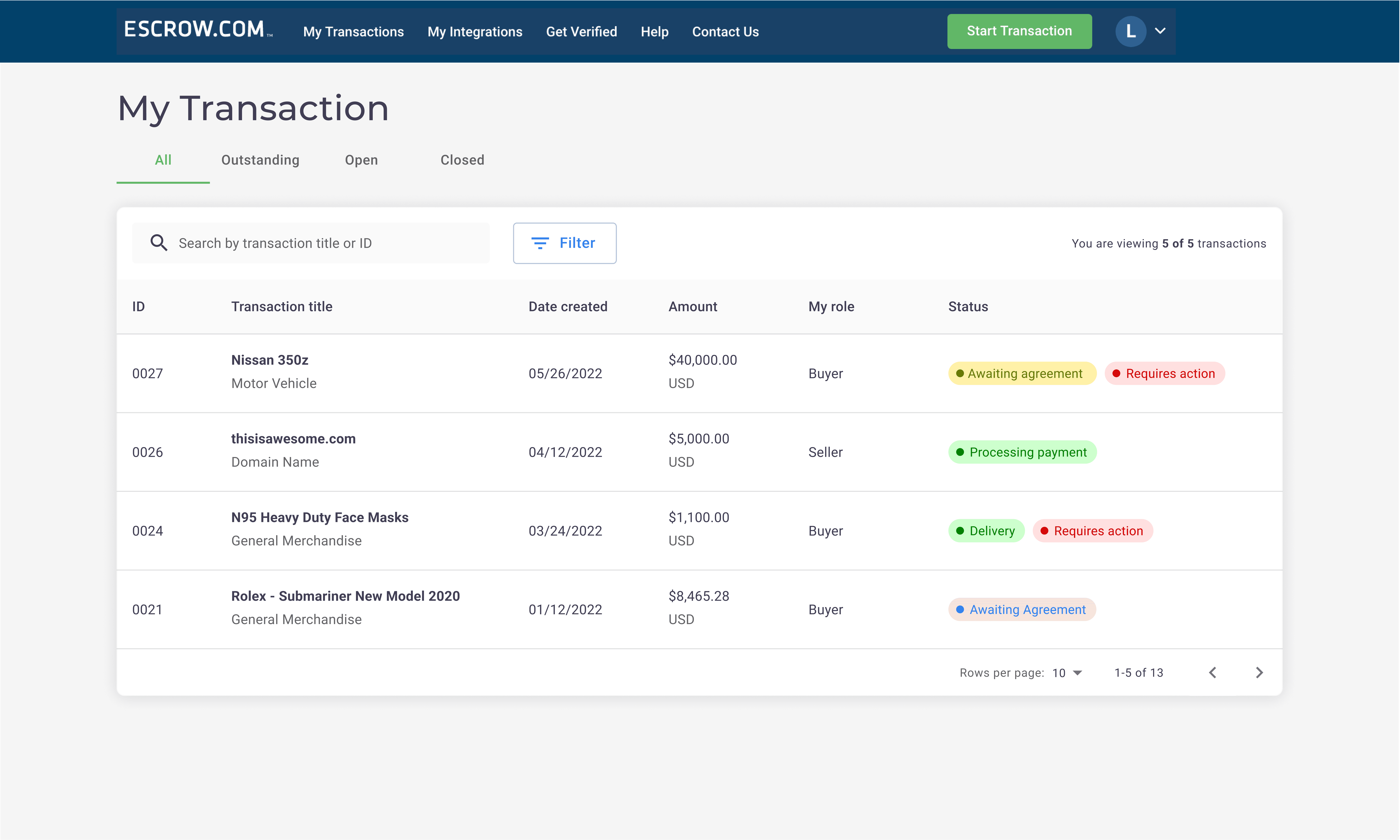
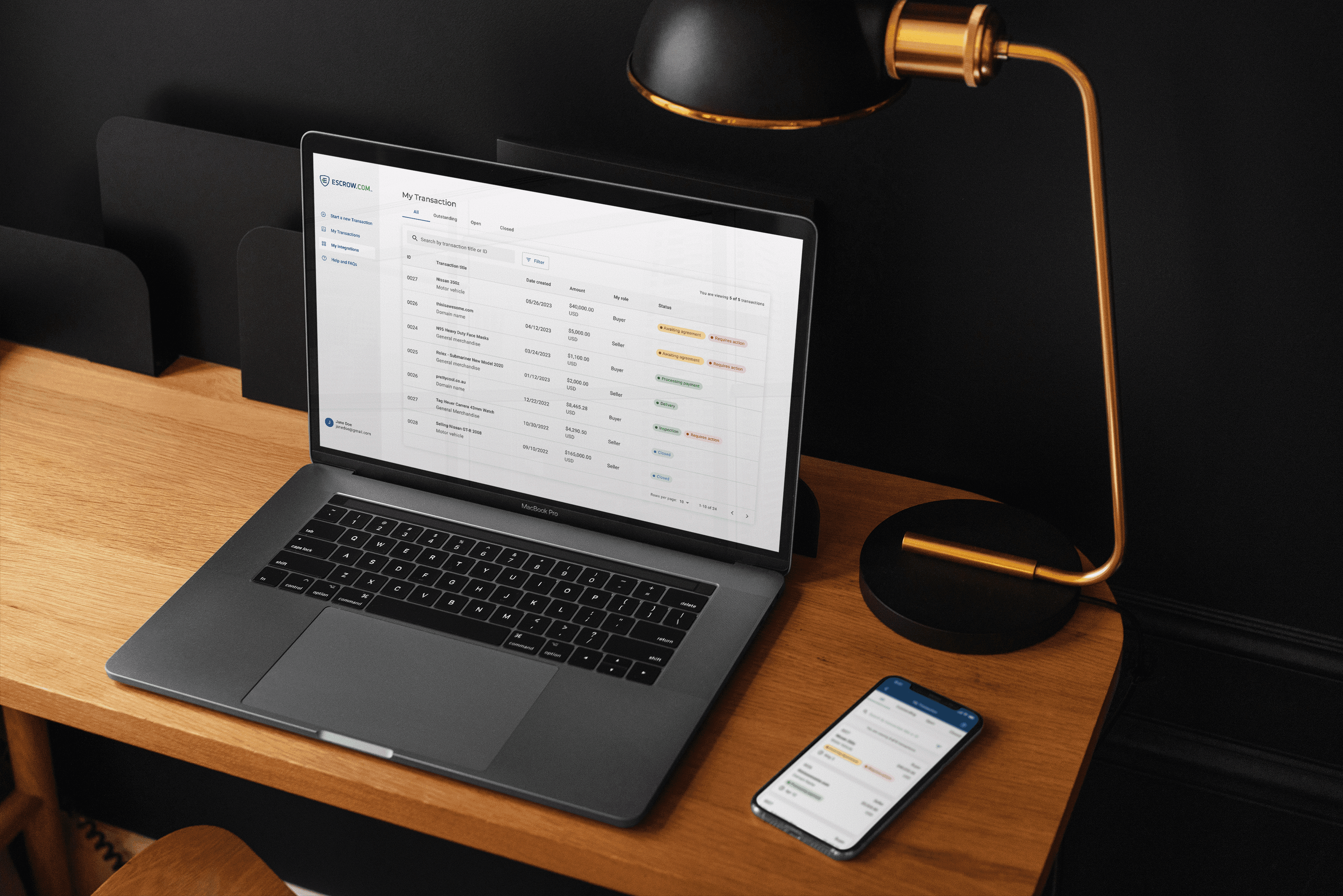
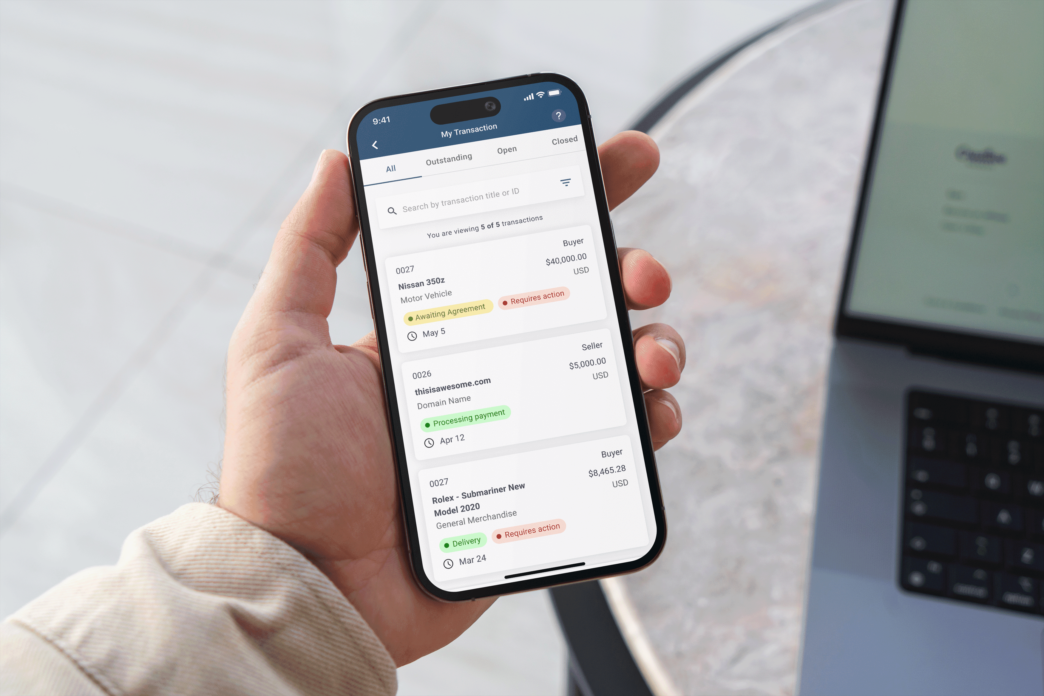
With Escrow.com's My Transaction Dashboard, users gain full visibility into their transactions and real-time status updates, empowering them to stay informed and in control every step of the way.
My role
Being the only designer, I closely cooperate with the product manager and manage a group of engineers. In unison, we join forces to turn concepts into outstanding products. I interpret user requirements into instinctive designs, harmonizing them with the product plan.
The users
Before we get into the rest, let's look at who our users are.
Buyers & Sellers
Buyers and sellers are typically individuals or businesses that conduct their transactions on third-party platforms, such as eBay for general merchandise or vehicles, and GoDaddy for domain names. However there are cases were buyers purchase directly from the sellers.
Brokers
Escrow.com is also used by a variety of brokers such as domain brokers, automotive brokersm, art brokers, jewelry brokers, and intellectual property brokers just to name a few.
What does our users say?
We gathered user feedback through surveys and direct complaints. Here is what they said:
The Problem
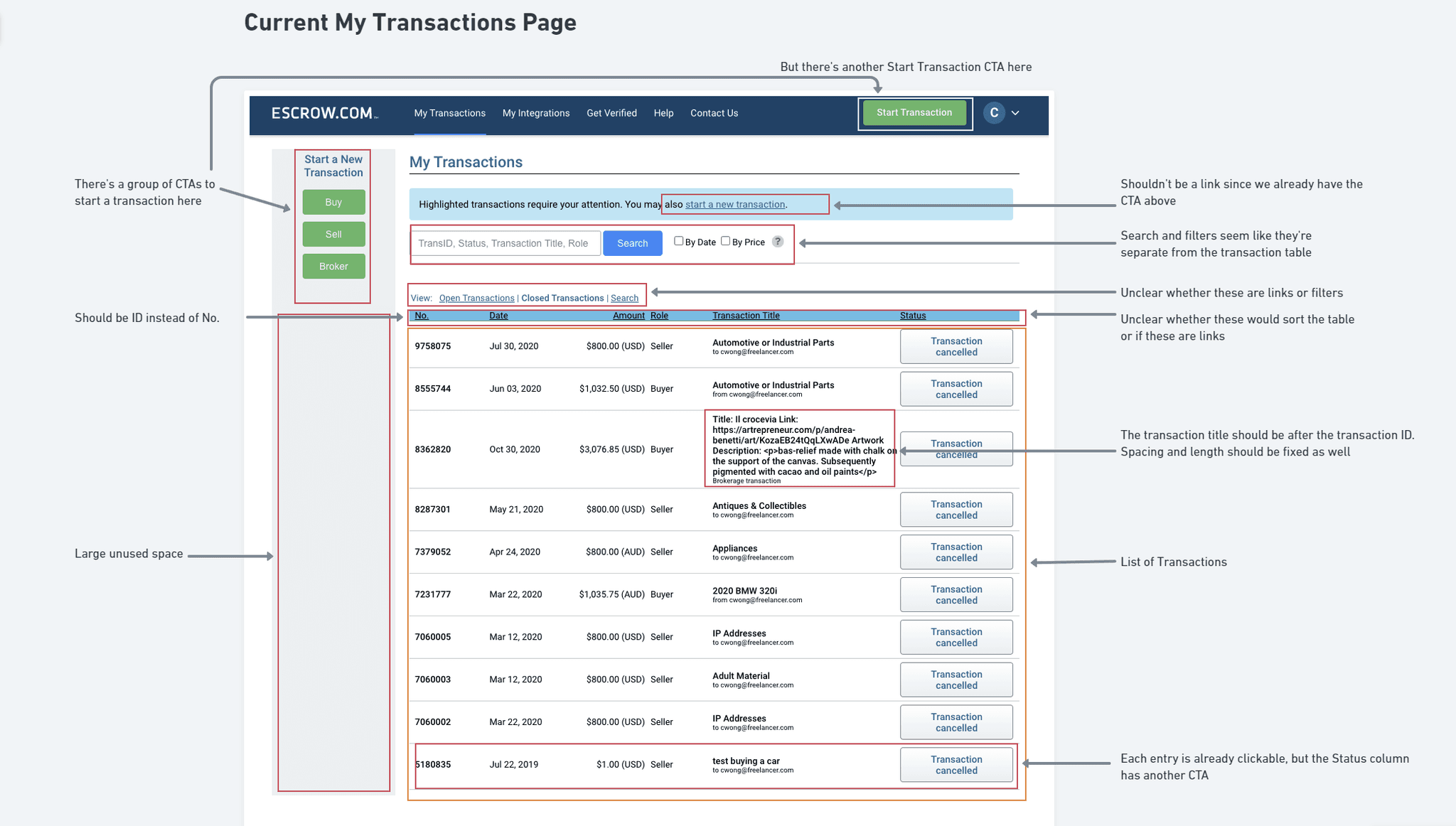
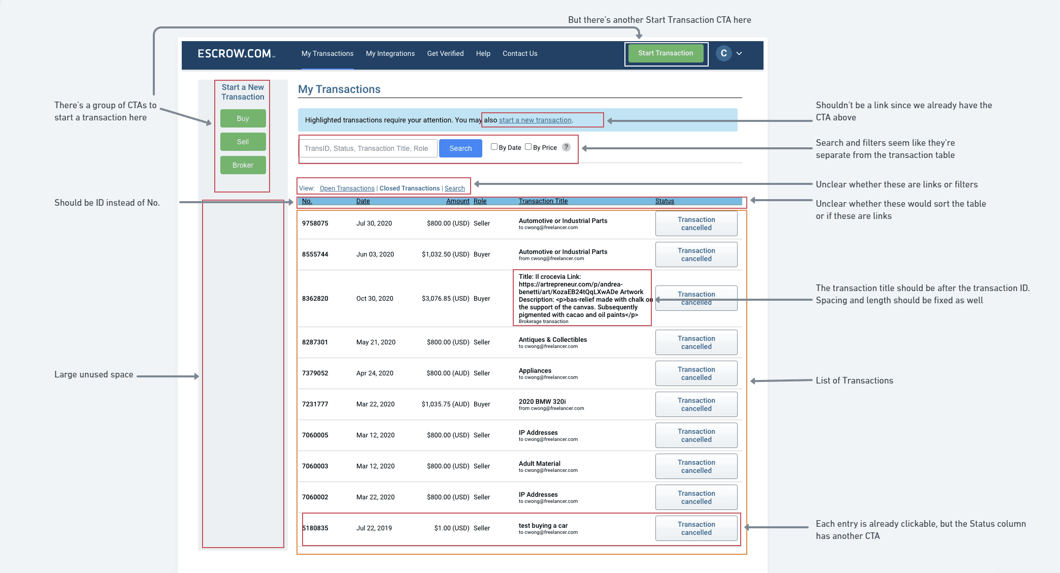
From the user feedback that we gathered, we identified the main problems that we need to address.
Design goal
To create a dashboard that is easy to use, efficient, and effective for managing transactions.
Sketches
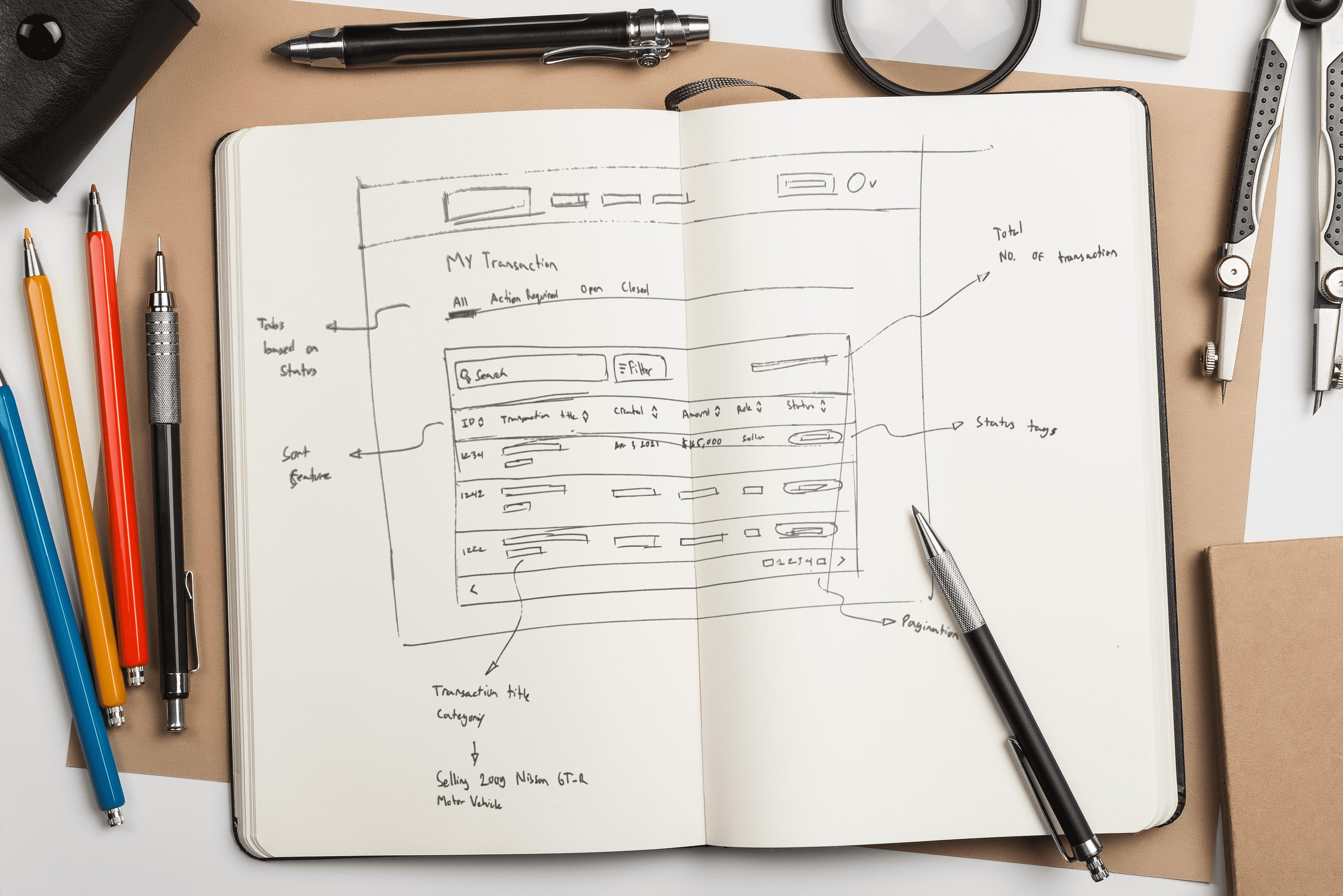
I began sketching solutions based on the problems and design goals. One solution that received positive feedback from stakeholders was to add an "Action required" tab and status tag to address the lack of prioritization problem.
Lofi wireframes
I started with low fidelity wireframes to communicate my ideas to my stakeholder and get initial feedback. I started by creating a simple sketch of the overall layout of the design before slowly adding the required details.
1st Hi-fi designs
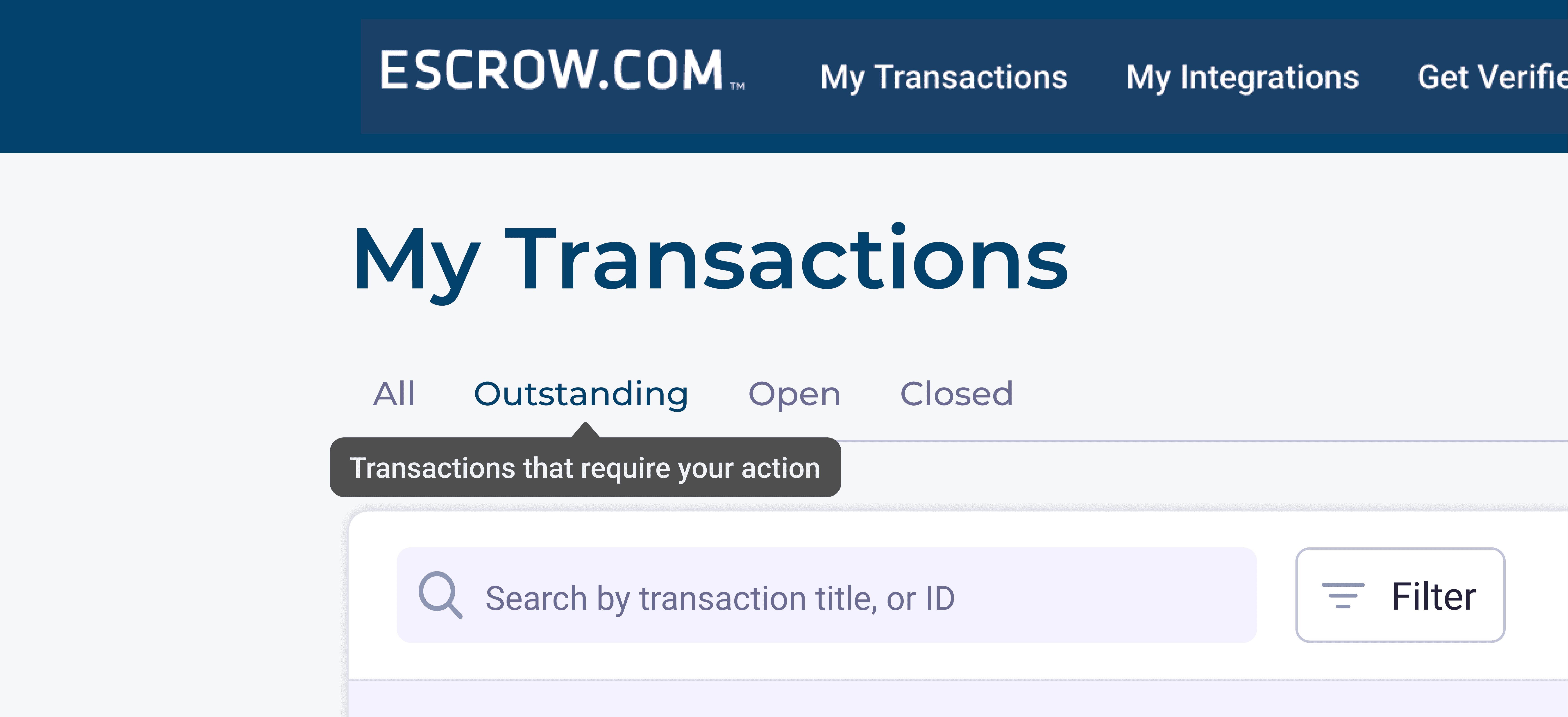
The initial feedback on the lo-fi designs were mostly positive. The main criticism was the tabs were confusing. So we changed it from "ongoing", "pending", and "complete" to "outstanding", "open", and "closed", a language that our users are more familiar with.
Preparing for user testing
I continue to build the necessary features and creating a functional prototype in Figma to use for user testing. I have also planned user testing questions to inform and validate my design.
Sketches
I began sketching solutions based on the problems and design goals. One solution that received positive feedback from stakeholders was to add an "Action required" tab and status tag to address the lack of prioritization problem.
User testing
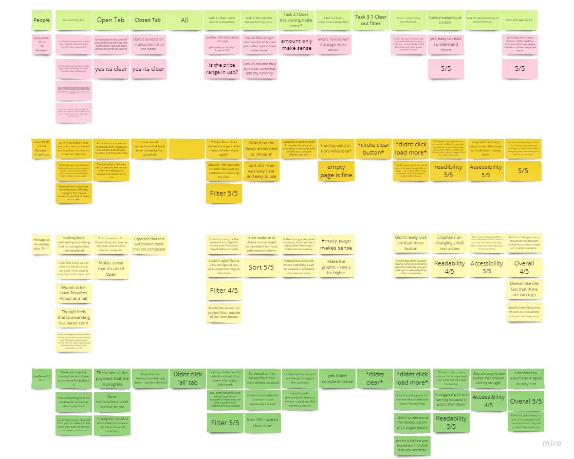
I conducted user testing with 12 participants aged 24 to 46 who have experience with high-price purchases.I gave the participants a scenario of tracking a transaction that required their action and asked them to speak aloud their thought process as they used the prototype.
… And here are the results
4
/12 users
Understands what "outstanding" tab means.
This is not ideal so we had to change the name to something else. A few participants suggested "pending".

12
/12 users
Understands what "requires action" tag means.
This finding validates our solution for prioritizing urgent transactions.
12
/12 users
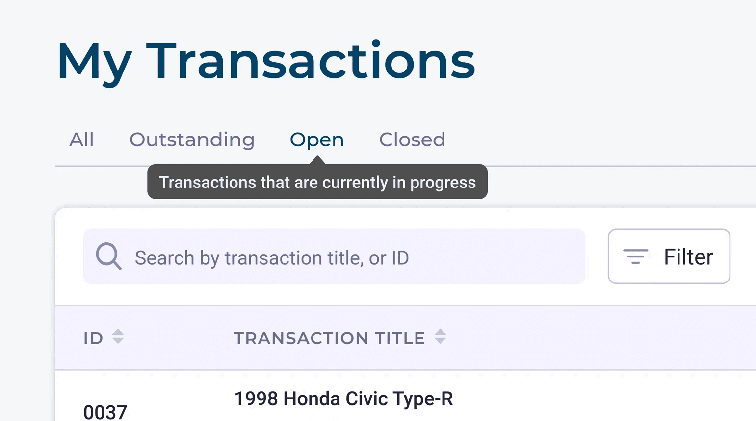
Understands what "open" & "closed" tab means.
This finding also validates our solution, so we don't have to change it any further.
4.75
/5 rating
12 users rated the filter function out of 5
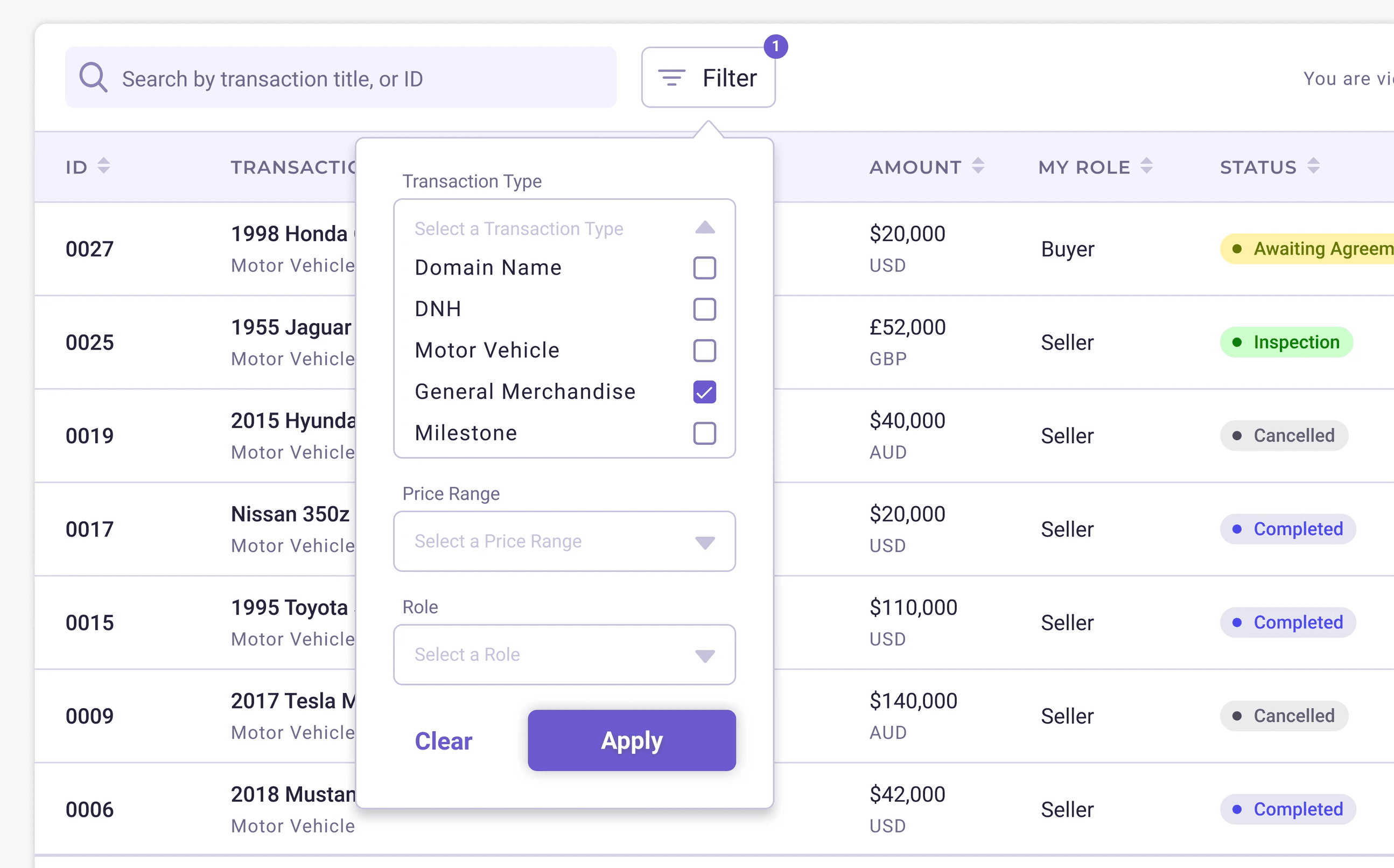
This means that our filter function works pretty well. One improvement some users suggested is to have the selected filters as tags next to it.

4.58
/5 ratings
12 users rated the sort function out of 5
The sort function is working well, but the sort arrows are too small, causing usability issues. Five users didn't notice the arrows at first.

7
/12 users
Prefers to have an expanding list with infinite scrolling
While the other 3 participants prefer to have pagination as they find it easier to navigate.
User testing findings
User testing confirmed some design decisions, while also revealing areas for improvement. The data suggests that the design is effective and user-friendly, but it's also worth noting the 4 out of 12 users who did not fully understand the "Outstanding" tab, which may warrant further investigation or potential design adjustments.
READABILITY
4.54
/5
ACCESSIBILITY
4.5
/5
OVERAL EXPERIENCE
4.63
/5
Polish and design system update
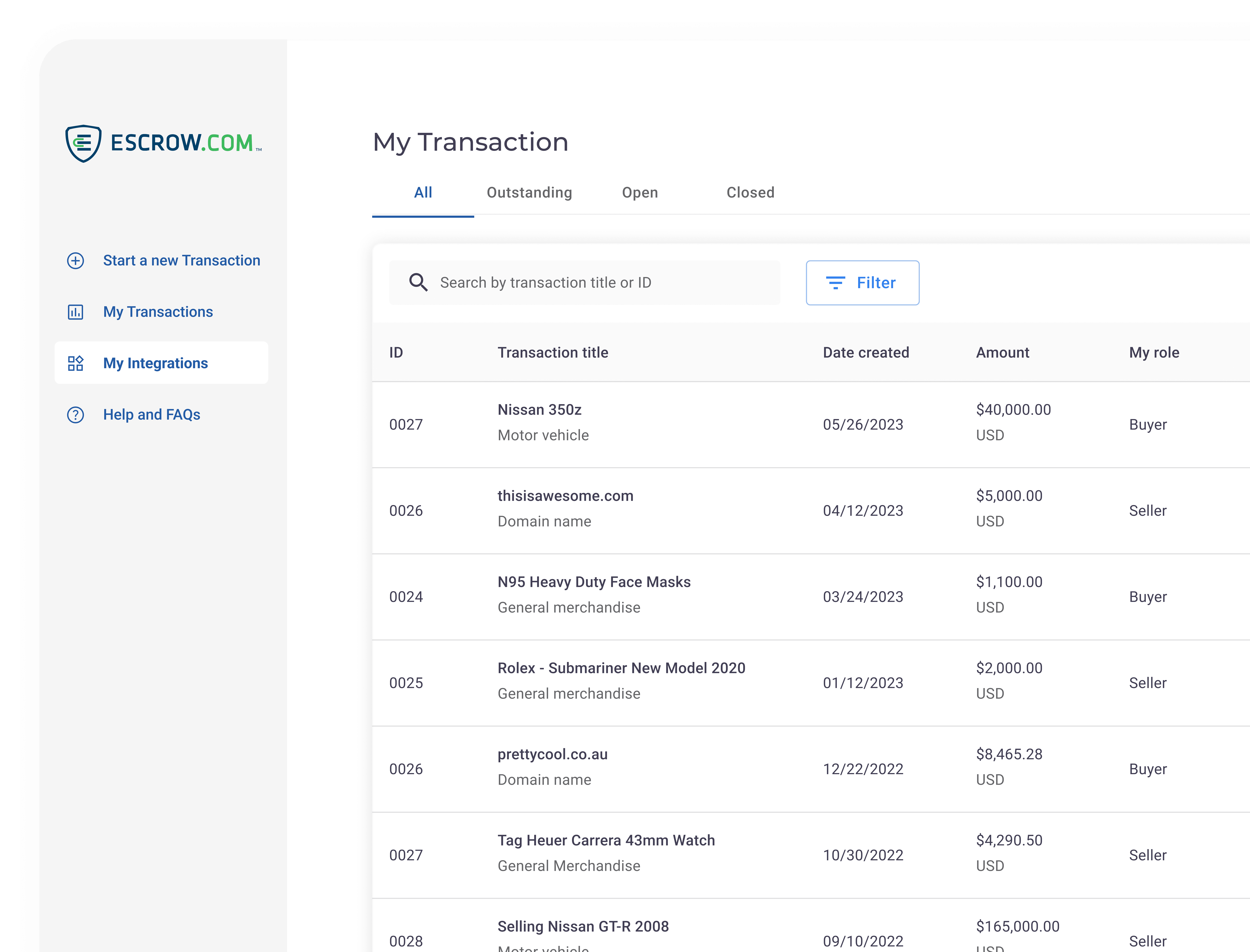
As our design became more intricate and considering our plans to tackle additional projects, we required a strategy to preserve our aesthetic and functional consistency across varied designs, alongside a more effective method for our engineers toimplement them—thus, we a design system. We opted for Material UI design system, due to their aesthetically pleasing elements and the comprehensive set of components they provides.
What does our key users say?
The next step was sending our newly polished figma prototype to our power users, and their feedback are interesting, compared to our user testing.
Positive feedbacks
Aesthetics
Overall, the new design's aesthetics received highly positive feedback.
Clear prioritization for urgent matters
Our key users appreciate having urgent transactions highlighted and displayed clearly. This solution addresses the issue of crucial actions getting lost, which can lead to delays, misunderstandings, and potential consequences with their clients.
Improved visibility and readibilty
The dashboard is now less overwhelming, with color-coded statuses on transactions that are easier to understand.
Sorting and filter functions
Our power users are very happy with the addition of the sorting and filter functions
Negative feedbacks
Load more feature is inefficient
For power users who deals with 10+ transaction a day, load more and infinite scrolling when browsing the transaction is the wrong pattern.
"Every time I want to work on the next transaction, I have to click again 'Open' + "Amount' + 16 times on the 'load more', and scroll forever.
This is time consuming, not an improvement."
- User
Some status tag aren't clear
Some wording on the status tag are a bit confusing.
"'Delivery' is to broad it should be more specific, something like 'awaiting delivery'"
- User
Slightly overwhelmed with the changes
One feedback that stood out was a user found the changes a bit overwhelming, this is due to the change in workflow. Even though the changes are positive, this sense of 'being overwhelmed' when seeing the design for the firs time is not a good experience, especialy for new users.
The final design
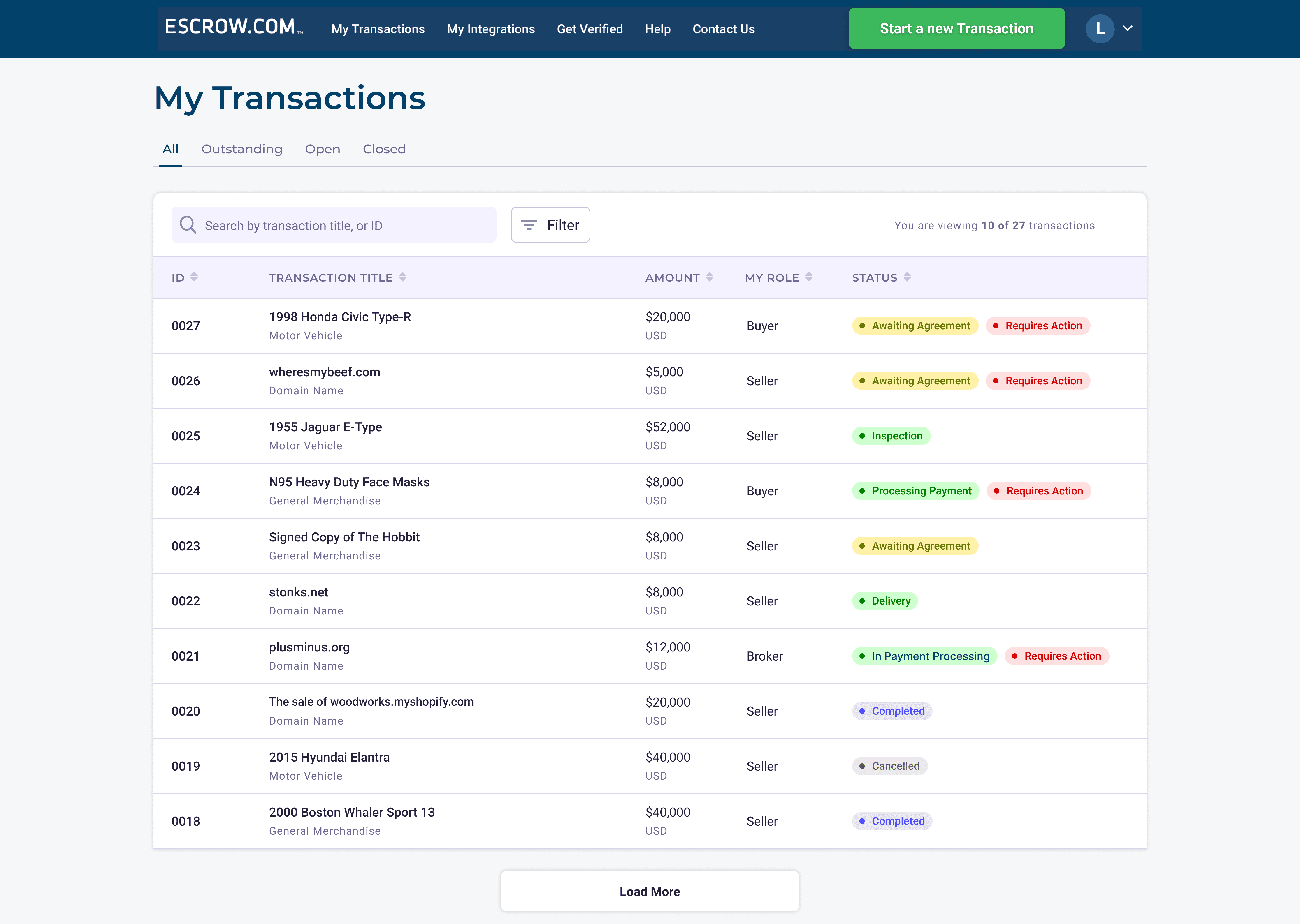
To wrap up the project, I did the final changes and polish based on the feedbacks from our power users.
Product walkthrough
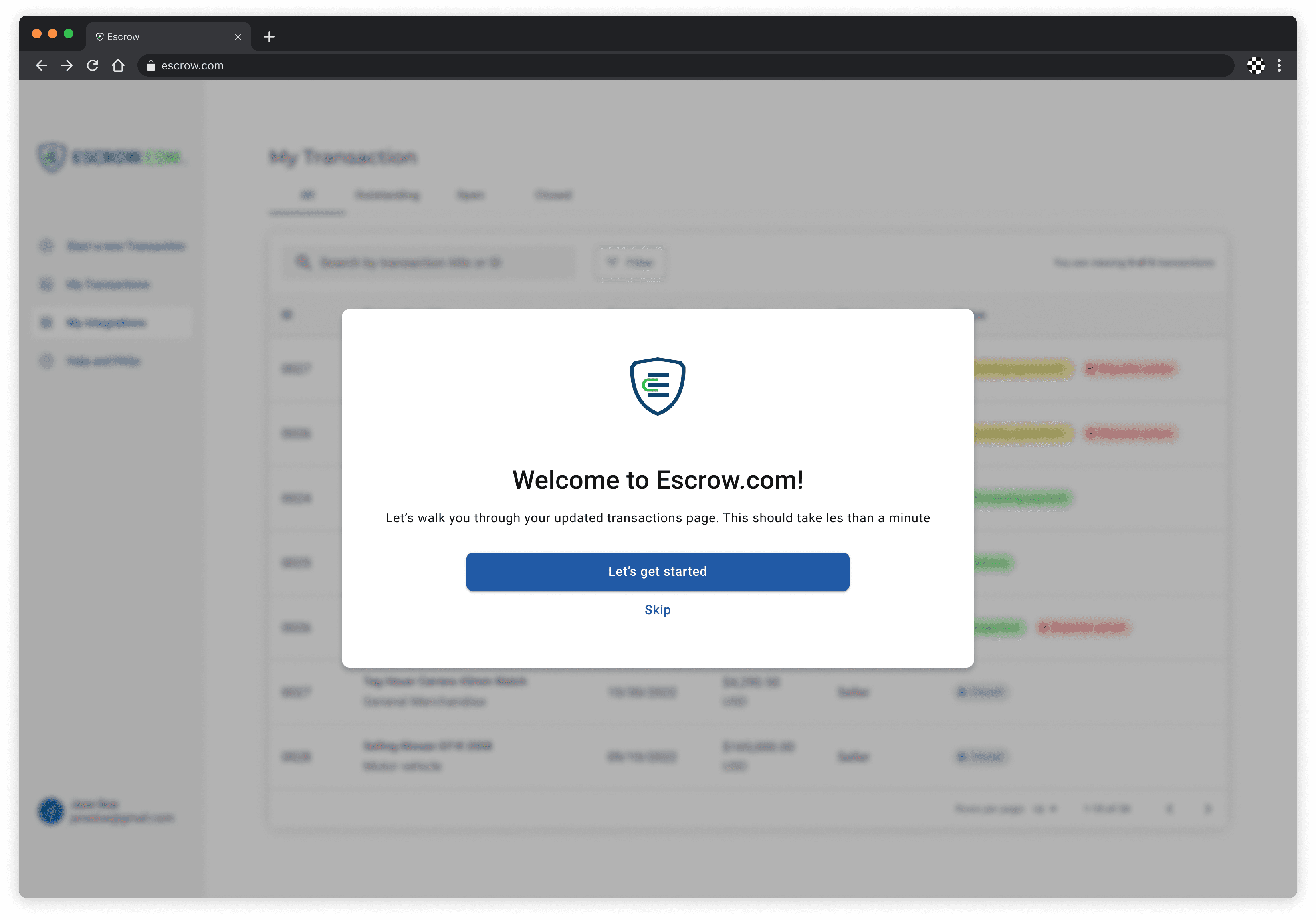
To solve the issue of users getting overwhelmed with the new layout, i created a product walkthrough or guide to help user understand where the key features are and
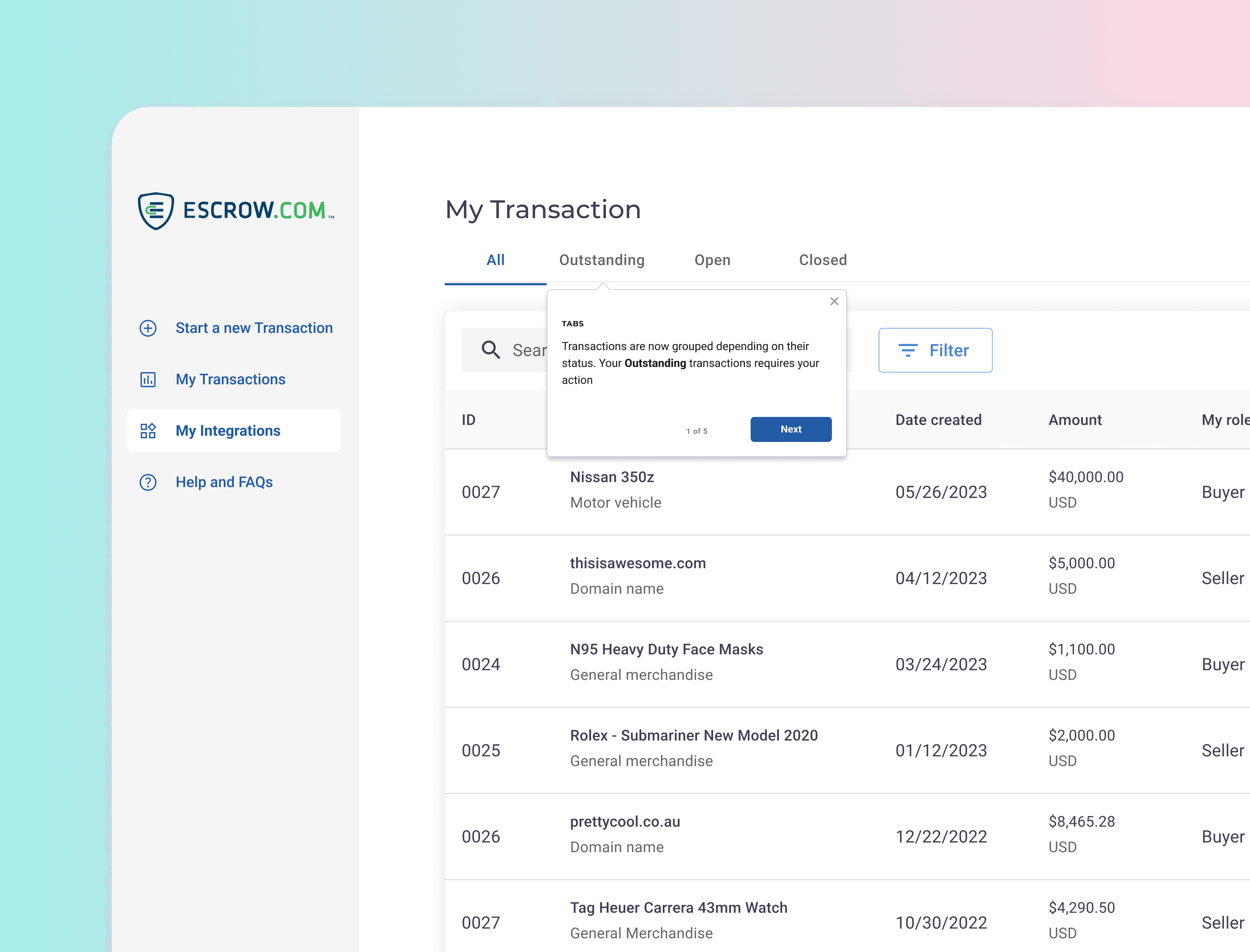
High fidelity designs
To wrap up the project, I did the final changes and polish based on the feedbacks from our power users.
The results
When the My Transaction design was released in october 2021, we found that the revenue was up by 159% from the last 6 months. "This huge growth in revenue and GPV is largely contributed by our Account Management Team as account managed transactions have grown 460% WoW." Which means that the new transaction dashboard has helped improve the process of managing transactions.
Lesson learned
When designing a large scale product, a design system is required to maintain consistency, streamline collaboration, and accelerate the development process by providing a centralized repository of design principles, components, and guidelines.
Performing user testing with different types of users is crucial, as their feedback may vary, as is the case with casual users and power users.
Ask for feedback frequently especially from users to ensure that the final product meets their needs, preferences, and usability expectations.
Site built in Framer
Copyright© 2022.
