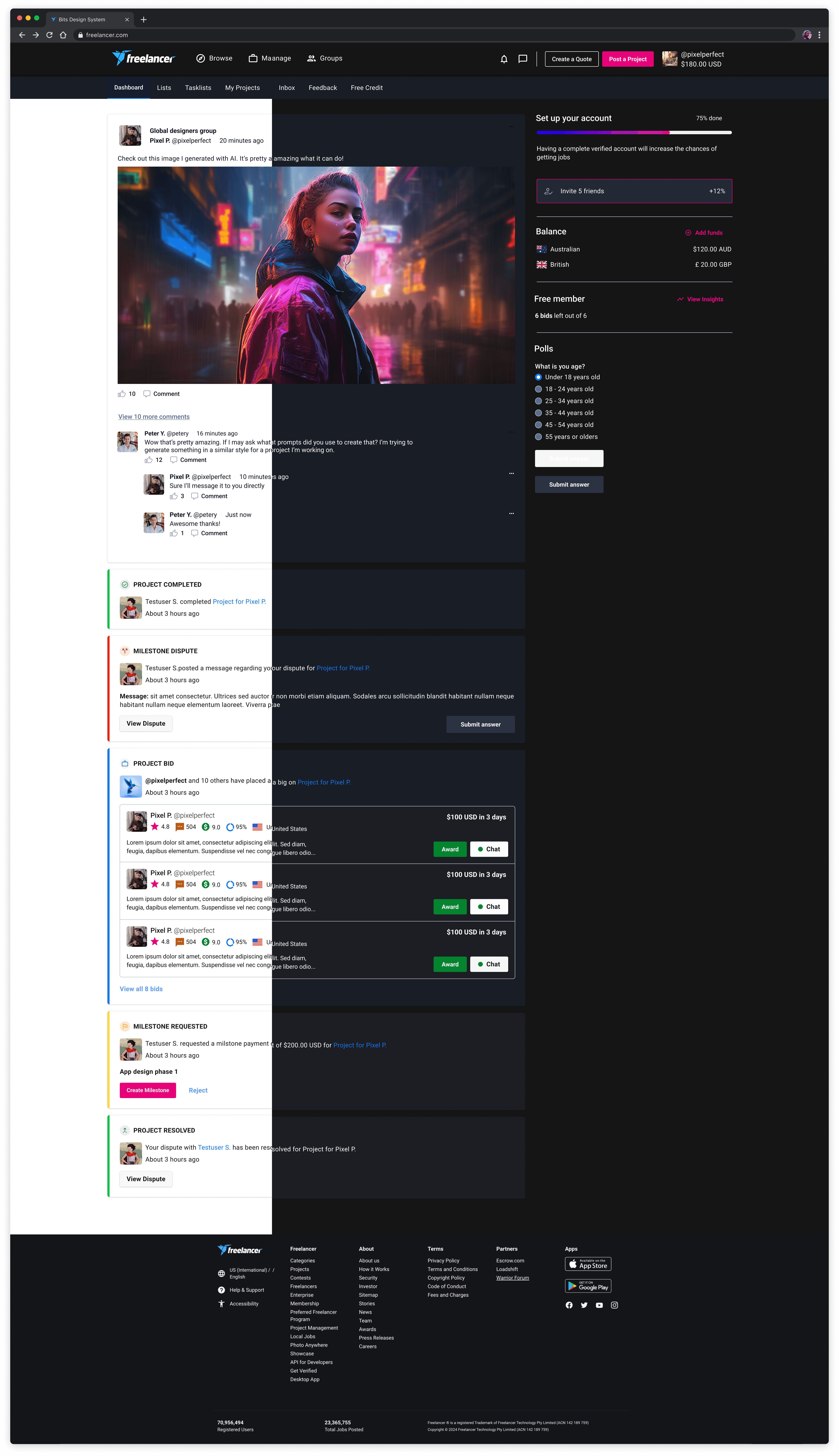
Bits is Freelancer.com's official design system used by designers, engineers, and product managers to create the Freelancer.com platform.
My role
As a product designer, my goal is not just to maintain and improve our design system, but to build Bits into a world-class design system.
The problem(s)
01
Lack of adoption
02
Inconsistency
Outdated and poorly maintained components caused UX and UI inconsistencies accross the platform.
03
Poor documentation
Poor documentations and lack of proper guidelines results in team member not using the components properly or in the wrong context.
04
Lacking design element
Our current landing page
The process
As a product designer, my goal is not just to maintain and improve our design system but to help build and evolve Bits into a world-class design system.
Research
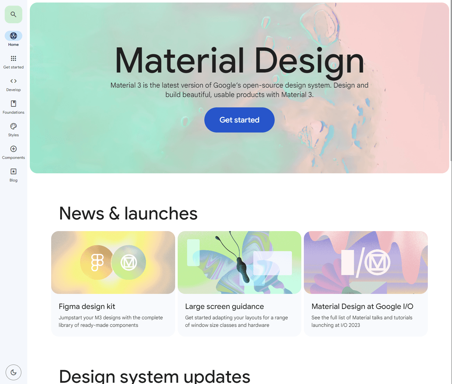
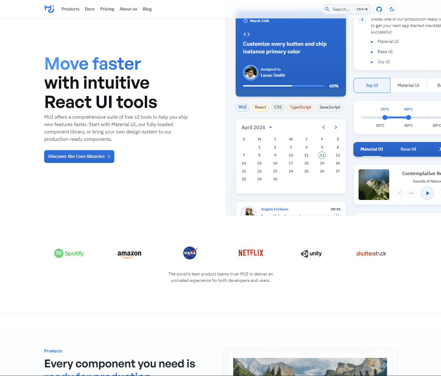
We looked at the world's leading design system and analyze what makes them world-class
Google's Material Design
React Material UI
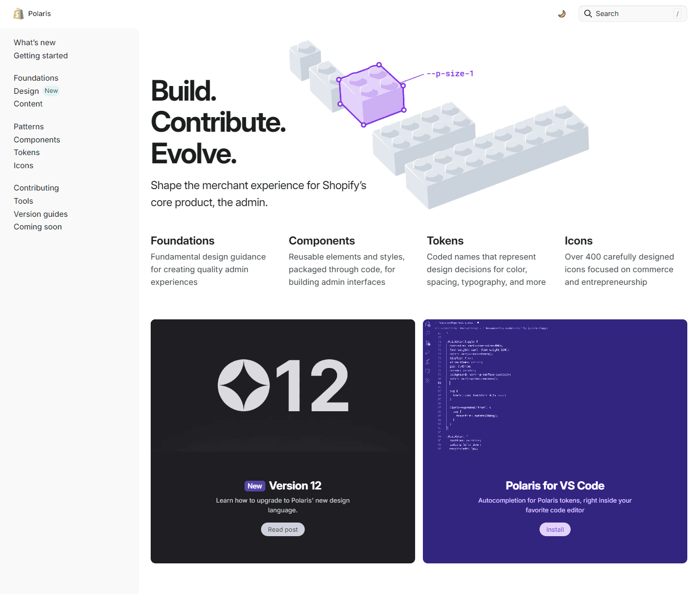
Shopify's Polaris
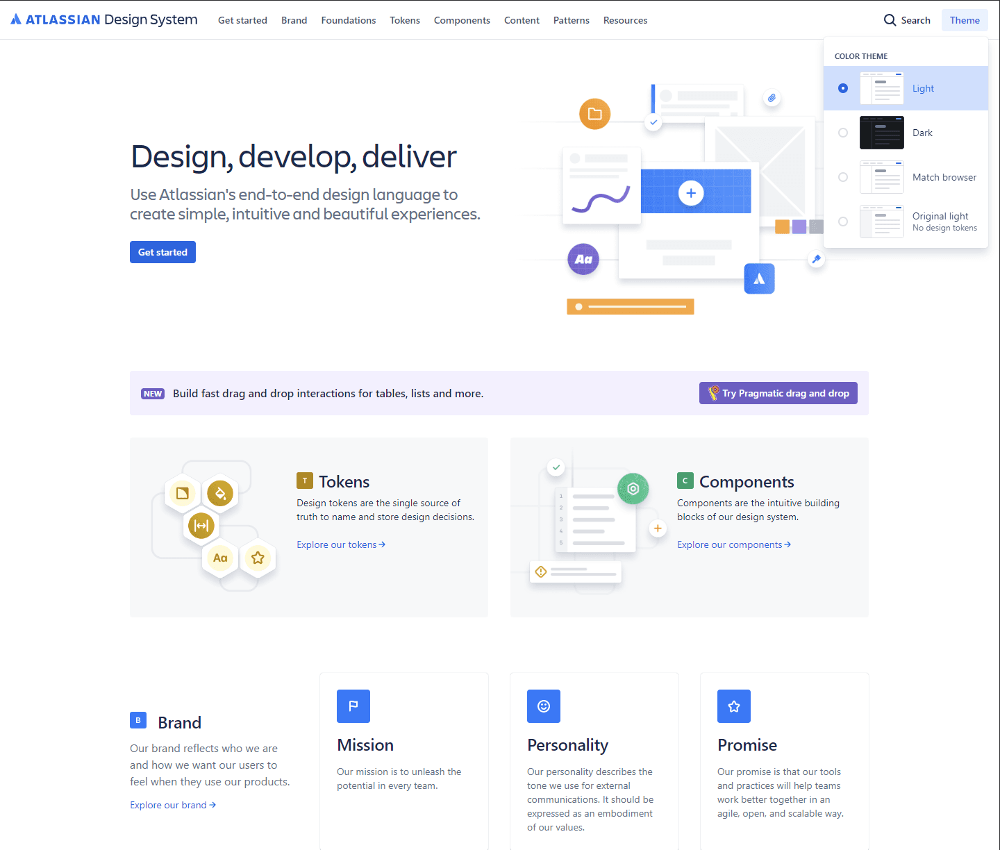
Atlassian's Design system
What makes a world-class design system?
01
Comprehensive and consistent
Offers a comprehensive set of design guidelines, principles, and components that ensure consistency across products and platforms.
02
User centered
Prioritises the needs and preferences of users, with components and patterns designed to enhance usability, accessibility, and overall user experience.
03
Scalable and modular
Design to scale with the platform's growth and evolving needs, with a modular structure that allows for easy expansion and customisation.
04
Well maintained
Regularly updated and maintained to keep pace with evolving design trends, and user needs, ensuring its relevance and effectiveness over time.
The website
Our goal is to turn Bits into a central hub for accessing documentation, guidelines, resources, and assets related to the design system. The process of transforming Bits is to help alleviate any confusion with engineering, design, product and marketing teams.
The landing page
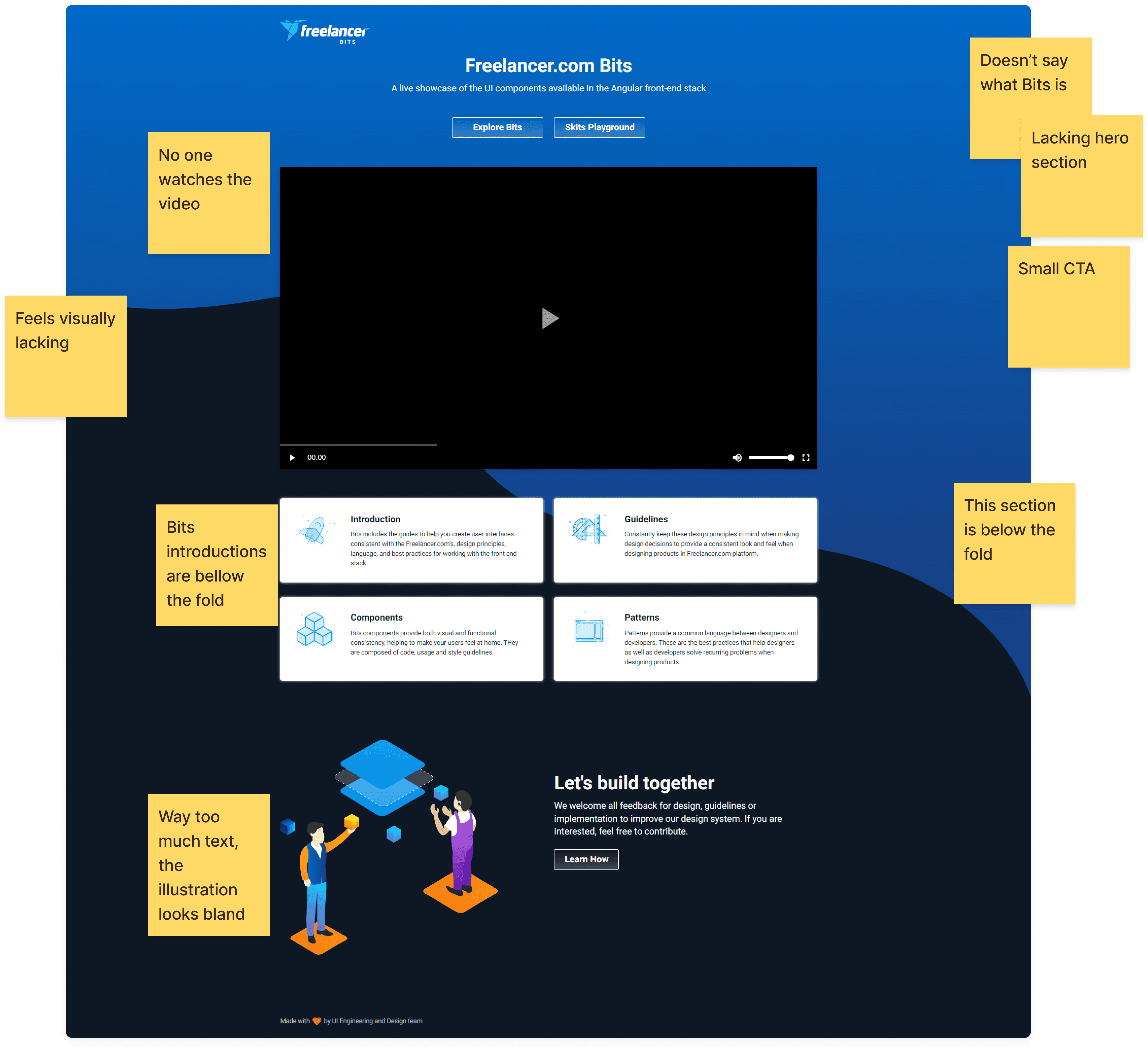
For starters, the first page the user sees is outdated. The landing page doesn't tell what Bits is capable of and the components are hidden away.
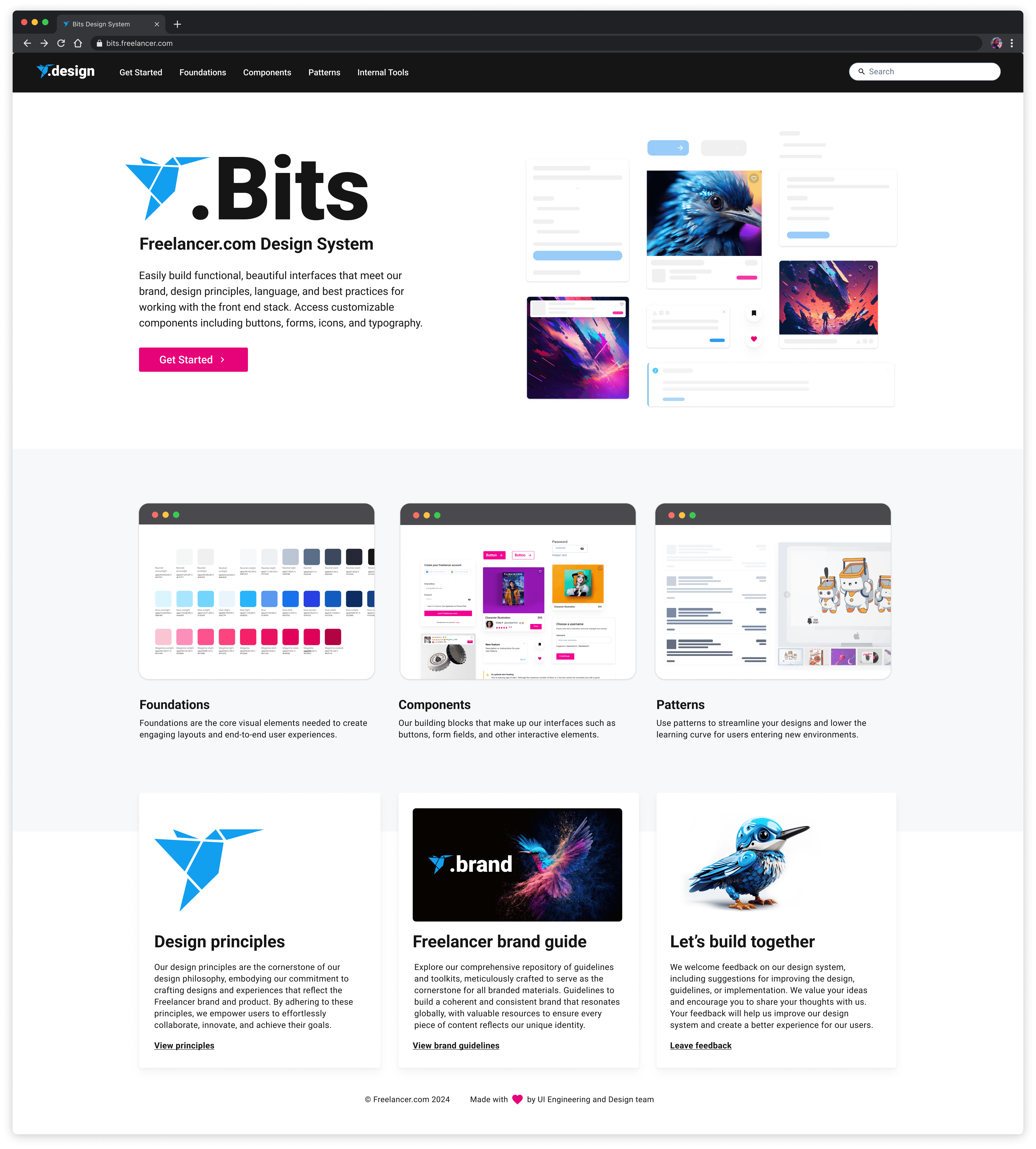
The landing page v2
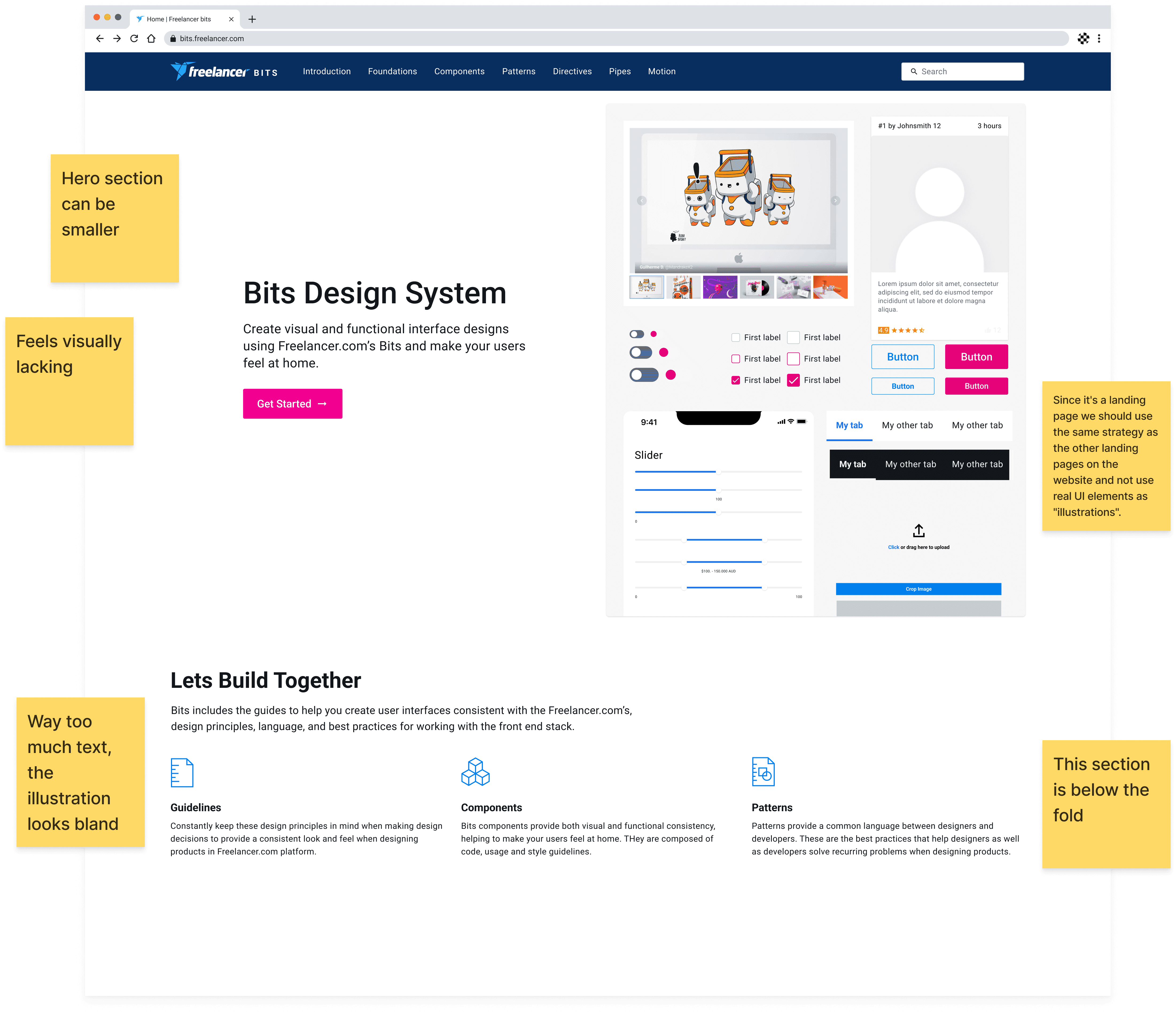
The main goal of the landing page is to give context to what Bits has to offer, while being eye catching and inviting. After doing research and a few rounds of design, I created a design version of the landing page that I'm happy with and presented to the team and stakeholders and got the following feedback.
The landing page v3
The components
As of today, I have designed and improve over 35+ components.
Identifying the problem
I started to identify the component that needs to be updated using the following:
Listening to feedback: from team members and users.
Analytics data: We can check which component encounter a lot of issues in the platform.
Outdated designs: Which makes the platform looks outdated too.
Industry trends: Looking at what are the current trends for the components.
Consistency and standardisation: Prioritise components that contribute to maintaining consistency and standardisation across products or interfaces.
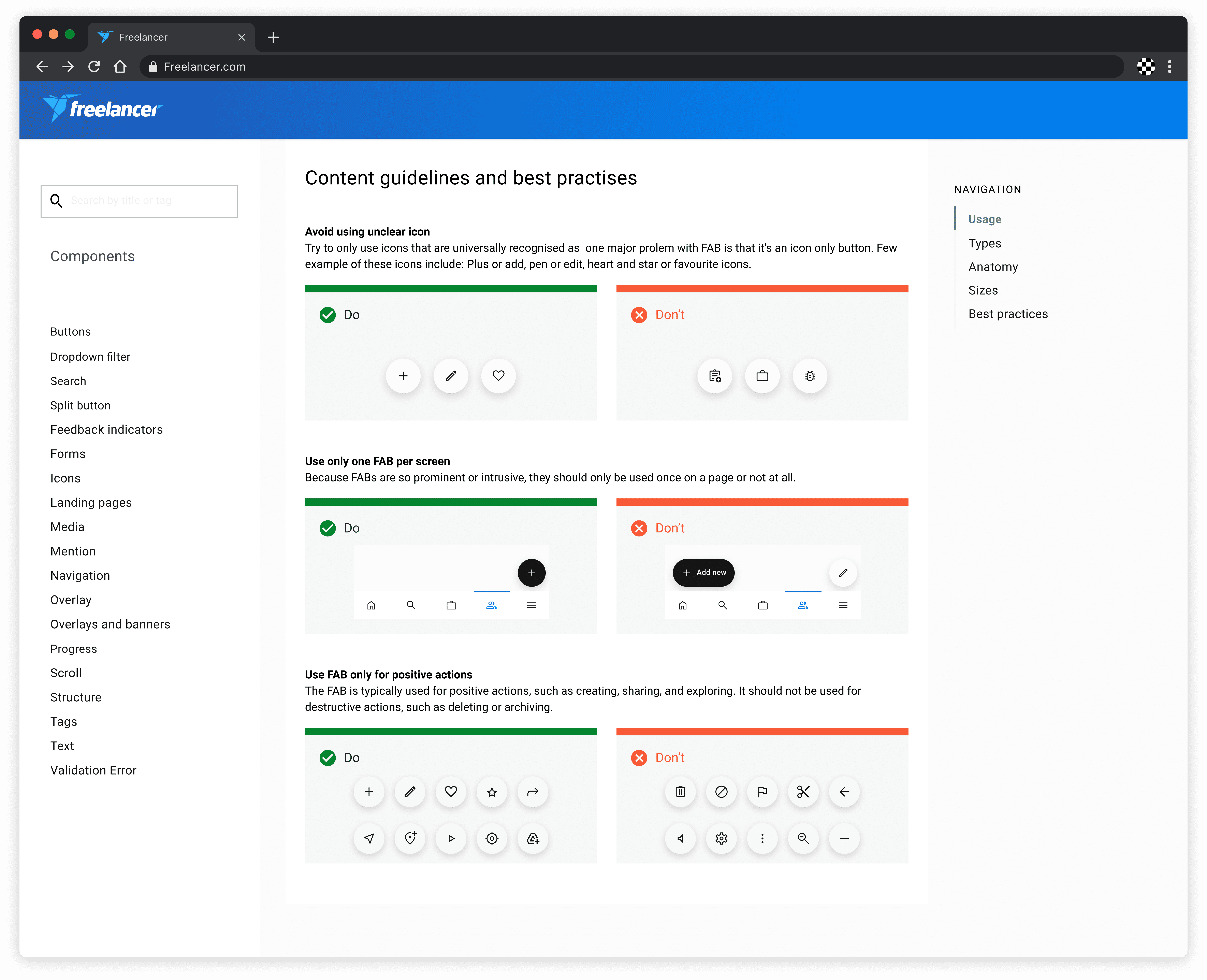
Guidelines and best practices research
When working on a component, I began with research. This involves studying the guidelines and best practices for creating a component, as well as looking at exemplary designs from other design systems. One example that I worked on is Floating Action Buttons (FABs).
Competitor research
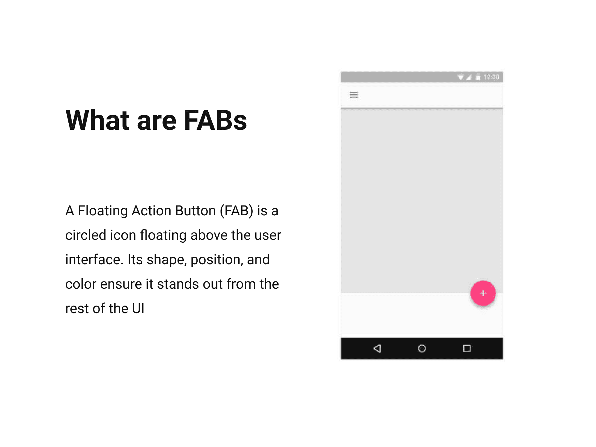
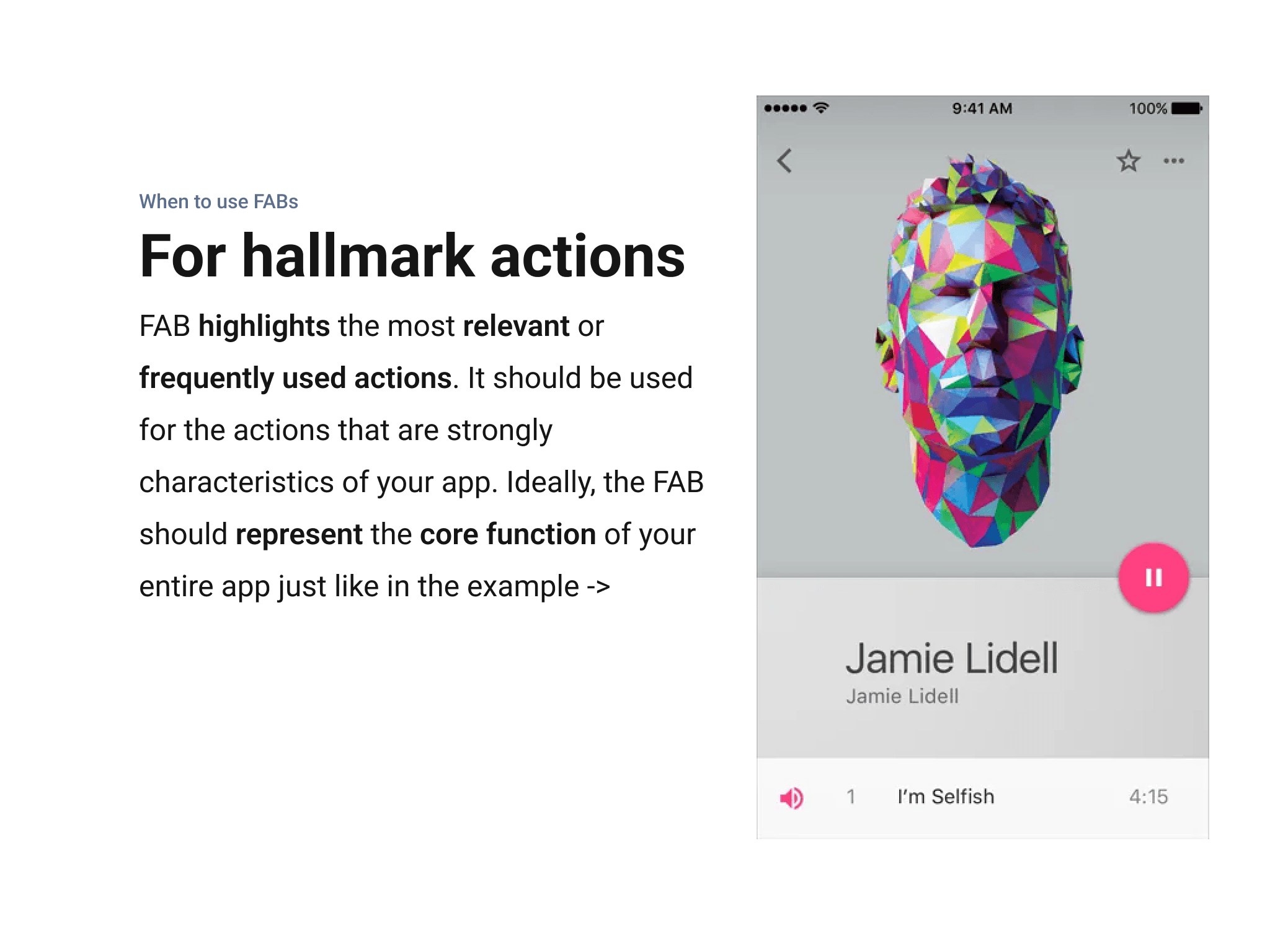
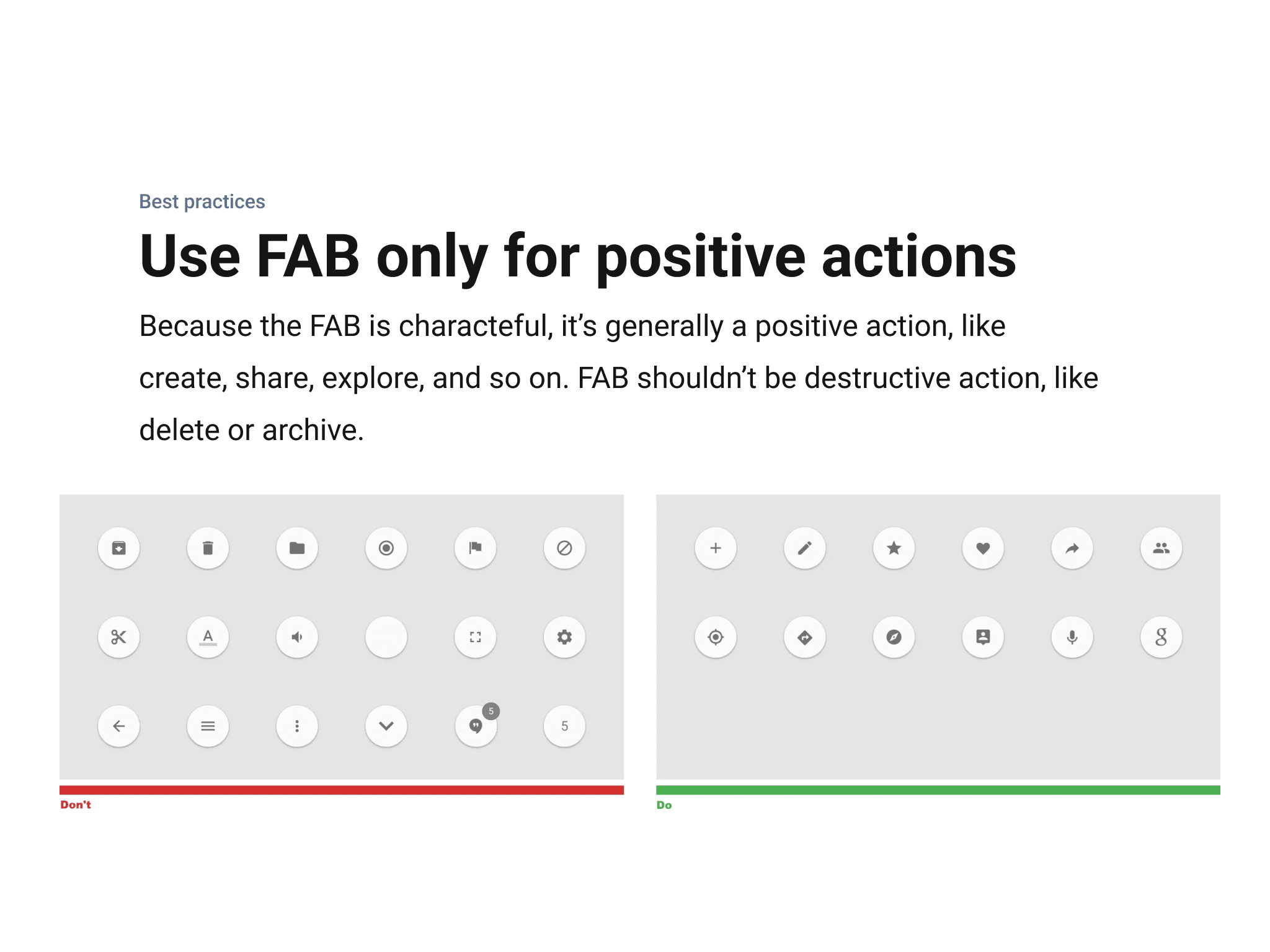
For the FAB component, I reviewed Google Material guidelines, which standardised the pattern and made it widely popular.
Google Material's FAB
The component design
The design process for components mirrors other design work, requiring ongoing refinement to ensure each component's style compliments the design system and platform.
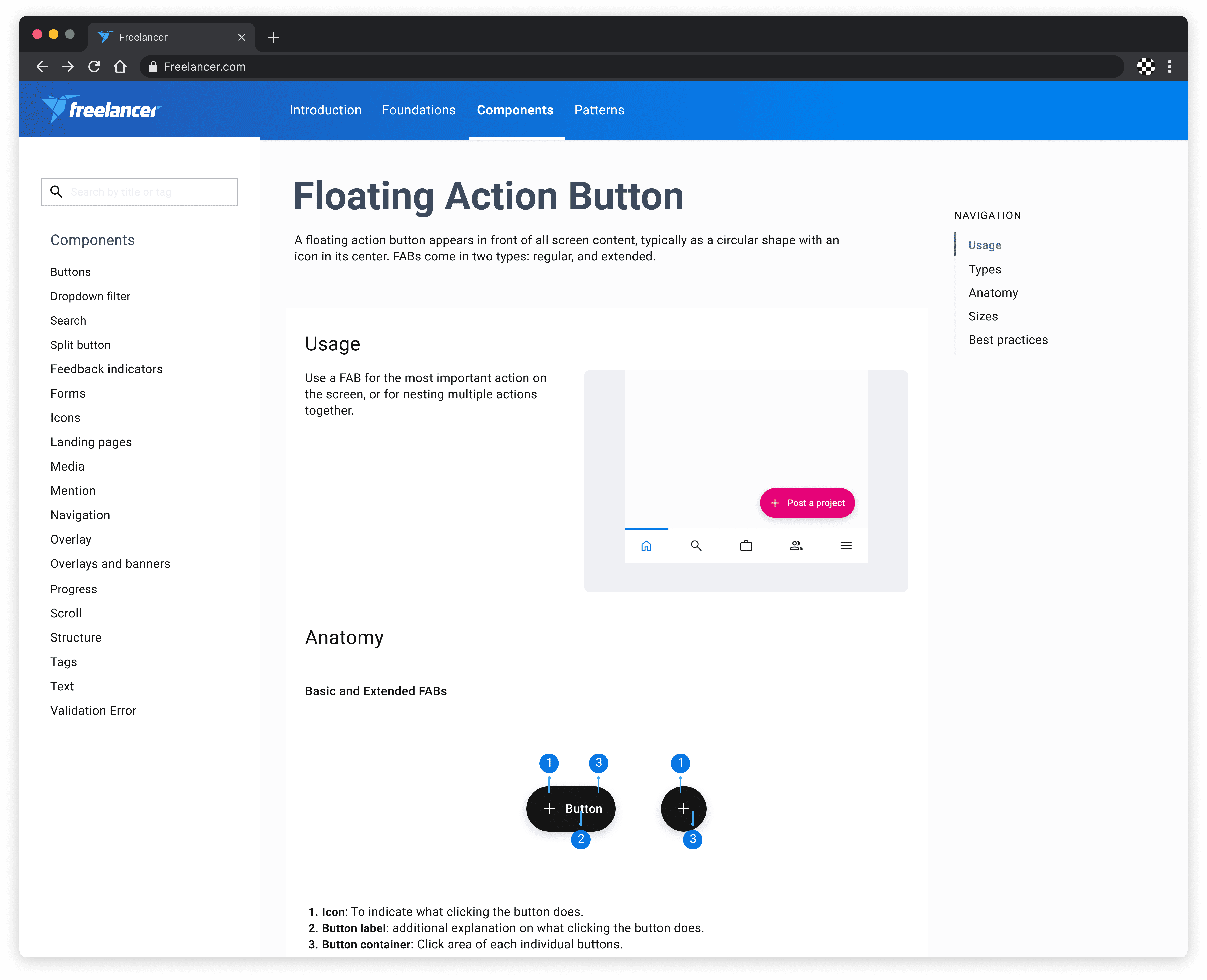
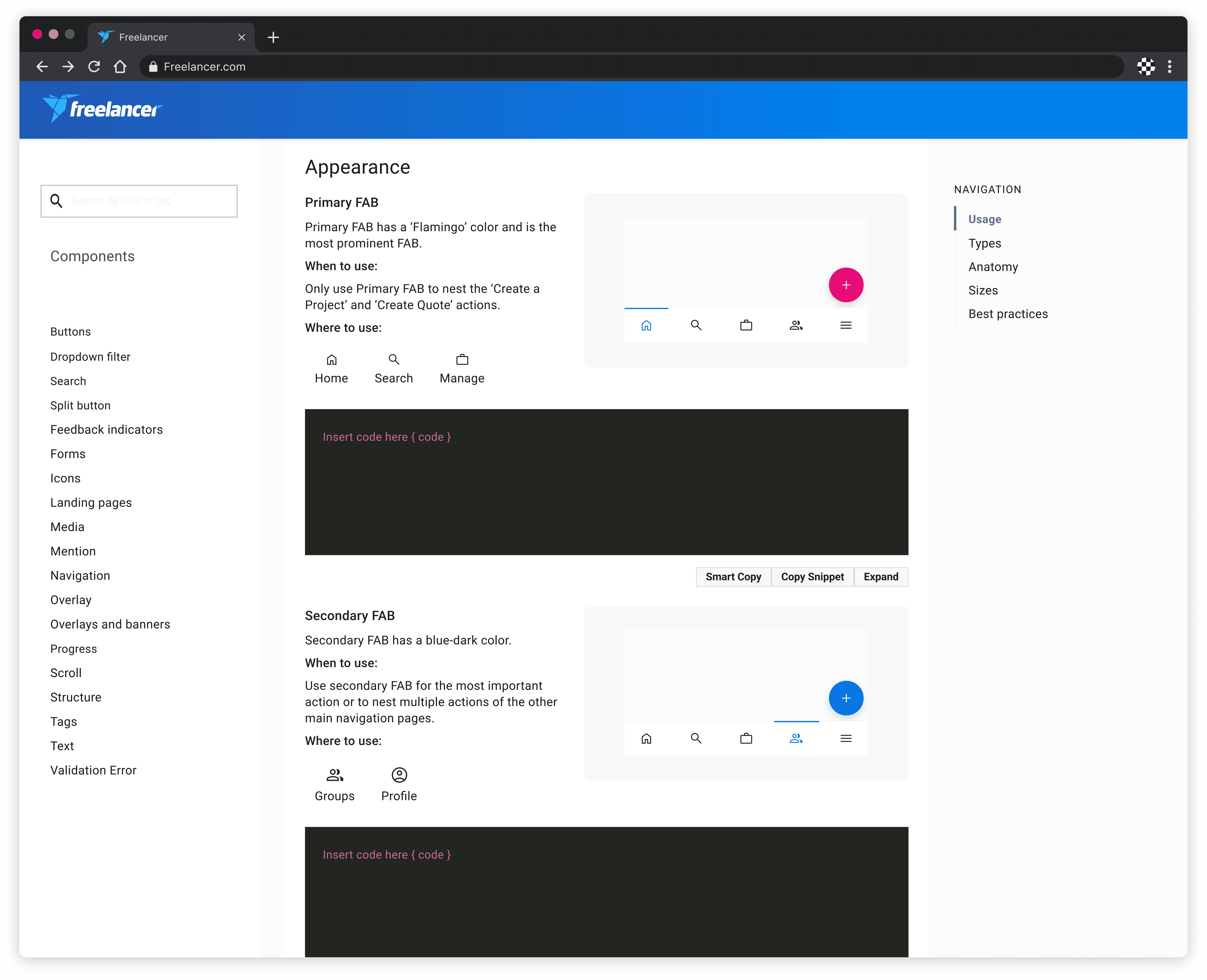
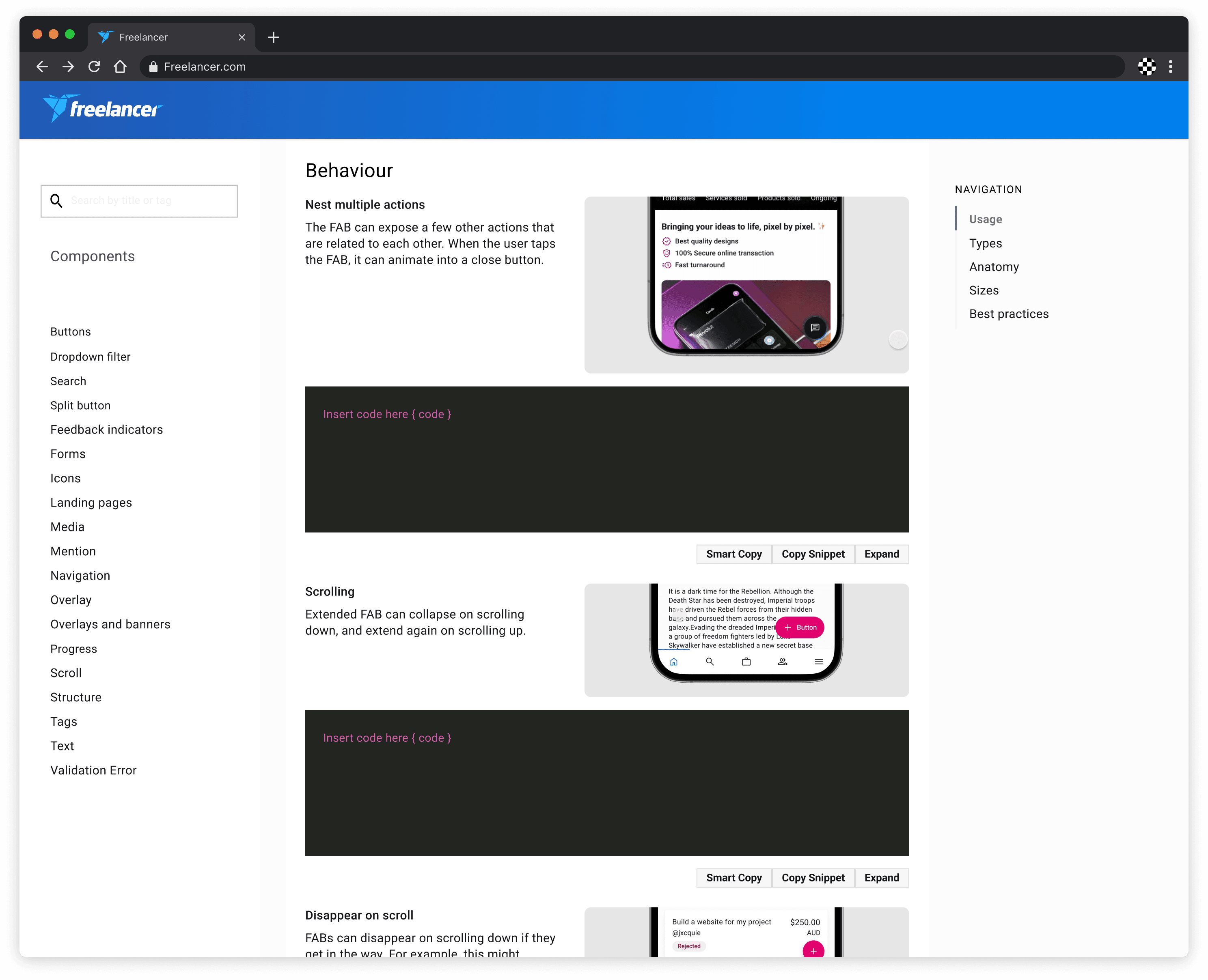
Our Bits FAB
Anatomy
Basic FABs
Icon: To indicate what clicking the button does.
Button label: Additional explanation on what clicking the button does.
Button container: Click area of each individual buttons.
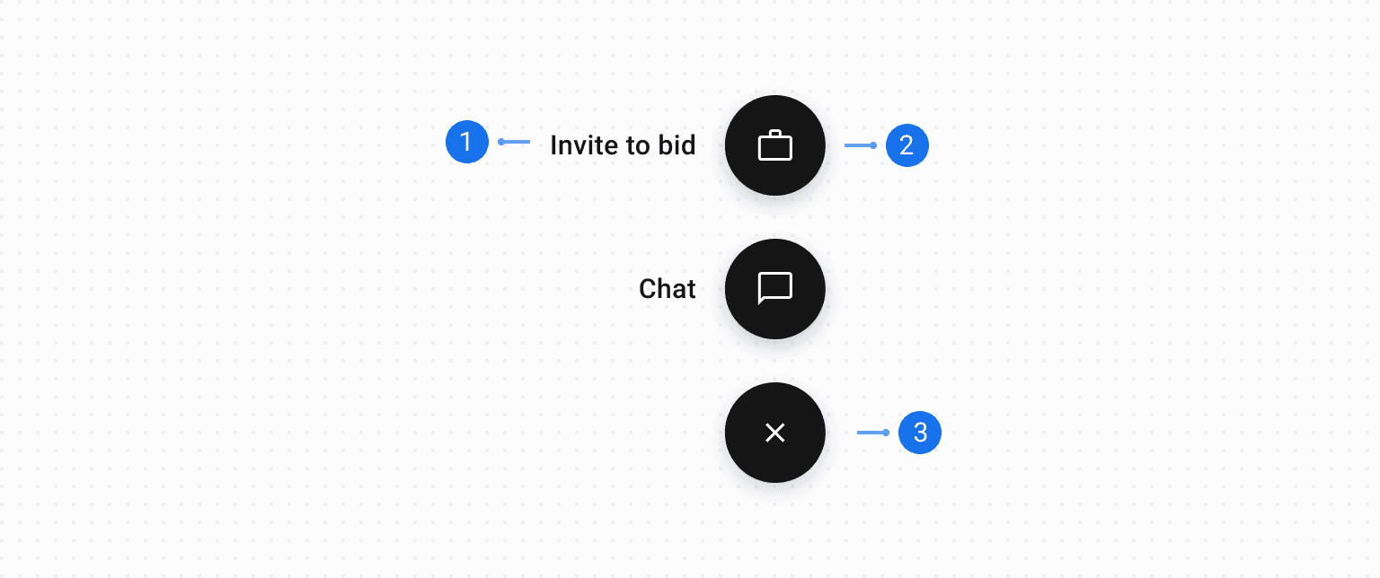
Extended FABs
Action label: To indicate what clicking the button does.
Icon: To further emphasise the action.
Floating Action Button (FAB): Upon clicking, the FAB becomes a close button to hide the other actions.
As of today, I have improved over 35+ components
Guidelines and documentation
Component guidelines and documentation are essential for explaining proper usage, optimal contexts and best practices for each component.
Maintaining an evolving design system
We regularly update documentation, incorporate feedback, evolve components to meet changing needs and ensure consistency with design standards and best practices.
The outcome
We addressed issues in our design system, creating a more cohesive set of components and guidelines. This led to better adherence by internal staff, minimising errors and avoiding page-breaking incidents. The revamped visuals also improved the main platform's UI, giving it a modern and appealing look.
